What to put in a retail design presentation
The images, the order and the framing that get a store concept approved — and the four slides that quietly lose the room.
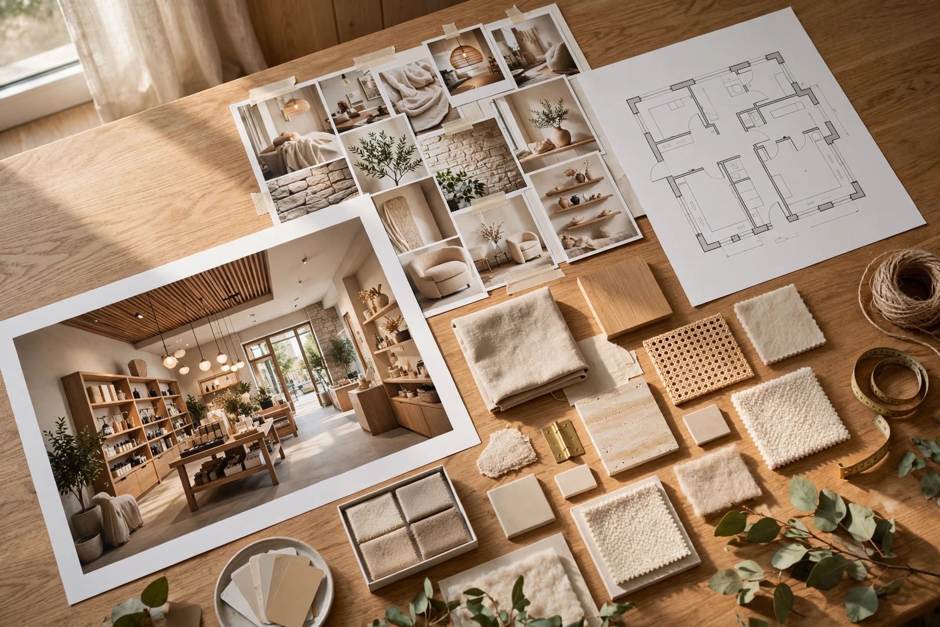
Concepts rarely lose on design. They lose because the client could not hold the idea in their head long enough to say yes to it. A presentation is a sequencing problem before it is a design problem.
The order that works
- 1The brief in one sentence, in their words. Proves you listened before you show anything.
- 2The entrance shot, eye level, full bleed. The strongest image, alone on the slide, before any explanation.
- 3The idea in three bullets. What changes, why it changes, what it does for the business.
- 4The brand direction: palette, materials, mood. Short — this is the logic behind the images, not a design education.
- 5Two or three more angles of the same space. Same render, different cameras, so it reads as one project.
- 6The plan, last. Zoning and circulation, once they already understand what the space feels like.
- 7Next steps, dates, cost band.
The plan going last is the part people resist and the part that matters most. A plan shown first turns the meeting into a discussion about square metres. The same plan shown sixth is read as confirmation of something they already like.
Four slides that lose the room
- A grid of twelve renders. Choosing is the client's least favourite activity. Choose for them and show three.
- A mood board of other people's stores. It invites the response "so it's like that one" — which is not your project.
- A materials slide with fourteen swatches. Four, named, with where each one goes.
- Renders that do not match each other. Different light or different flooring between slides reads as carelessness, even when nobody names it.
Make the images match
The last point is the one most easily fixed by process. If every view comes from the same base render, and every render for that client pulls from the same saved brand kit, coherence is the default rather than something you police slide by slide.
A client cannot articulate why five renders feel unrelated. They just trust the proposal less.
Leave something behind
Whatever happens in the room, the decision is usually made afterwards, by someone who was not there, looking at a PDF. So the leave-behind is not an afterthought — it is the actual deliverable. It needs the overview, the brand direction and the selected renders in one document, with your name on it and nothing named render-final-v3.
A short pre-send checklist
- One hero image, full bleed, no caption competing with it.
- Every render lit the same way and floored the same way.
- Four named materials, not fourteen swatches.
- The plan after the feeling, not before it.
- A dated next step on the final slide.
- A PDF that opens correctly on a phone.